Author DIY Graphic Design – The Basics
Estimated Reading Time:
Complete Author DIY Series
- The Basics of Design
- Colour Theory
- Typeface
- Layout
- Tools and Technicalities
- Design Process
- BONUS: Print Book Formatting
In the digital age of self-promotion, we are constantly producing content of all types online and offline. Production has become quicker and tools are more widely available for common people to use. This has created a massive increase in published content in the world. It can truly be overwhelming. The ease of accessible tools has made a lot of people dabbling with things they wouldn’t normally pick up, like graphic design, even though they have no fundamentals or knowledge of the basics. That is fair, it is not their profession.
Although, because there is so much readily available for people to create and produce, there are a lot of – dare I say it – bad designs being published. This post is not meant to bash and criticize work that is out there. We won’t get into the nitty gritty of what is wrong. Instead, we are going to look into design theory that can help you improve your marketing abilities as a writer.
If you want to dive deep into graphic design, there are plenty of tutorials and creditable sites out there that you can reference. You can even go you school if you wanted to. This Author DIY Graphic Design series is going to be focused around authors.
The Basics of Graphic Design
Design can be broken down into elements such as line, shape, form and texture – in the simplest idea. This is what we will cover today. You may be asking why do any of these matter to you, as a writer? They matter because if you want to make appealing designs for your work, you need to get a basic understanding of the… basics.
Line
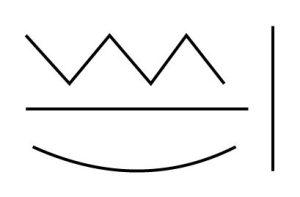
This is the starting point for most designs. The basics of the basic. It is literally what it is called, a point that extends from on end to the other. See the example below for the types of lines.
Shape
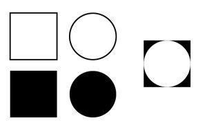
These are two dimensional objects. They are not the same as a line because the two end points meet. Shapes can be filled in or just outlines as seen in the example below. They can also be used to create negative space as seen in the shape to the far right. It is a circle inside of a square which also creates a triangle. So there are multiple ways of seeing the shape(s).
Form
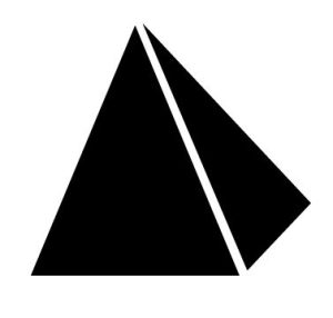
This is the next step up from shape. Form is how the piece visually appears. It is made up of line and shape. Form then has texture and colour (we will save colour for another time) applied to it. A form might be an icon, or a glyph in a typeface. Another simple example would be the two shapes used to form a pyramid below.
Texture
Pretty self-explanatory. Texture can be slick, smooth, rough. Do you want your book cover to have gold embossed text for the title? That is a texture.

Okay, so how do I apply these elements of design to my book cover, or promotional banners?
Good question! These are some of the terminologies you will need to familiarize yourself with when diving into the world of graphic design. It will give you a better sense of what you can do with graphic design tools when you can speak the same language. Again, we could dive much deeper into what graphic design is but there are entire courses built around teaching people graphic design.
Line, shape, form and texture are the building blocks to creating any type of graphics. Of course, you have more fundamentals like colour and mass for example.
We will dive into some practical topics as well, for now we are keeping staying in the theoretical realm.
Your Exercise
Pick up a pen and paper and draw! I know it sounds crazy, a writer drawing? Try it out though, experiment with the four elements we discussed. Draw a line, a shape, a form and texture. Visually experiencing these elements will help you familiarize with what they are.

About Konn Lavery
Konn Lavery is a Canadian author whose work has been recognized by Edmonton’s top five bestseller charts and by reviewers such as Readers’ Favorite, and Literary Titan.


