Complete Author DIY Series
- The Basics of Design
- Colour Theory
- Typeface
- Layout
- Tools and Technicalities
- Design Process
- BONUS: Print Book Formatting
Typefaces are a critical visual part of our work as writers. Open up any book, and you will see that the texts have varying weights, sizes and stylization from book to book. Choosing a typeface can change the entire mood of what you are representing.
Following the Author DIY Graphic Design series, we will now explore the wonderful world of typefaces.
Typeface Vs Font
These two terms are used interchangeably which isn’t the case. Typeface is what most people think a font is. For example, Arial is a typeface. Times New Roman is a typeface. Futura is a typeface. Fonts are the family within the typeface. If Arial is the typeface, Arial Bold, Arial Italic, Arial Black are the fonts.
Types of Typefaces
Now that we have clarified what the difference between typeface and font is, there is an even higher level of separation for typefaces. Typefaces fall under common categories as seen below.
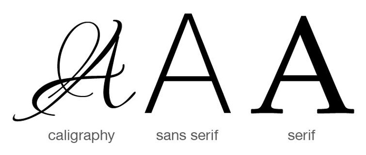
Calligraphy
A hand-written or script-based typeface that is decorative. They aren’t commonly used for large bodies of content and serve as a stylistic approach due to its readability.
Sans Serif
A sans serif typeface is a typeface like Arial or Helvetica. The characters in the alphabet stand firm on their own.
Serif
Serif fonts have the small feet at the ends of the characters in the alphabet. The feet behave like subconscious bridges from one character to the other to allow us to read content faster.
Picking the Right Typeface
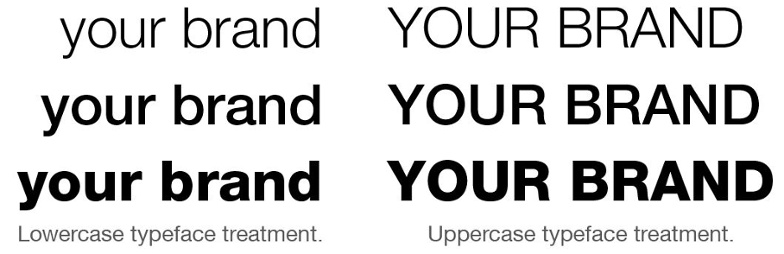
Knowing what typeface to use can be a challenge. Let’s say you are making a book cover, will you use all capitals, lowercase or formal English? Your choice will vary depending on your book’s genre, your target demographic and your own personal stylization. Thin fonts generally represent a more elegant visualization while heavier weighted fonts will be bolder and louder. If you’re using handwritten fonts, it can come across as more exquisite.
What do other authors do in your genre? Thriller covers often use a bold typeface for more impact. Romance or comedy novel covers tend to be more elegant with typeface choices. Knowing your genre will steer you to choosing the right typeface for your book cover.
Notice how different each of the examples look in the image below? All of them say “Your Brand” but vary significantly on appearance due to the choice of font and capitalization.
Anatomy of Type
We’ll only cover some basics you need to know for working with typefaces. The anatomy of type is an in-depth topic. Graphic designers specialize in typography and become what is known as typographers. There are plenty of books that dig into the details of type anatomy. For us, as authors, there are a few we should be wary of:
Kerning
This refers to space between to characters.
Leading
Leading references the spacing between two baselines. In other words, this is known as the line height. How far apart is each line of text in your novel?
Word Spacing
Word spacing is a lot like kerning but only applies to the space between words.
![]()
Each of the three pieces of anatomy mentioned help stylize your chosen typeface. Ever notice how poetry books tend to treat typefaces different than a genre novel? They use space quite strategically to express their words.
Know Your Project
Remember when I said we’d be chatting about projects a lot in this series? It’s because the context is critical. Your choice of typeface visually represents the words your book is wanting to portray.
Tips and Resources
There are plenty of sites that offer typefaces. Some are for a price and others are free. Some offer free for personal use but not commercial. Be sure to read the details before downloading a font.
Some sites worth reviewing for typefaces are fontsquirrel.com, dafont.com and typekit.com.
Headlines vs Content
Not sure what works for a typeface? A good rule of thumb is to use sans serif fonts as headlines and serif fonts for large bodies of content. As mentioned above, sans-serif fonts help guides the eye. Sans serifs fonts have each character be more prominent which works well for headlines (chapter titles or book titles).
eBooks vs. Print Books
Print books we can use any font imaginable. Of course, as long as the book is readable. eBooks are trickier because not all eReaders support different typefaces. eReaders have improved drastically over the years for typeface support but aren’t quite there yet. You will find you have less control over typefaces with eBooks and unfortunately it is the way the industry works.
Your Exercise
This is a two-part exercise.
Part one: Next time you’re in a bookstore, examine five different books from different genres and see how they handle typefaces on their covers and interior pages. Ask yourself, why did they choose these typefaces?
Part two: Remember that book cover we chatted about in the colour theory post? Time to pick the right typefaces for your project.


No Comments