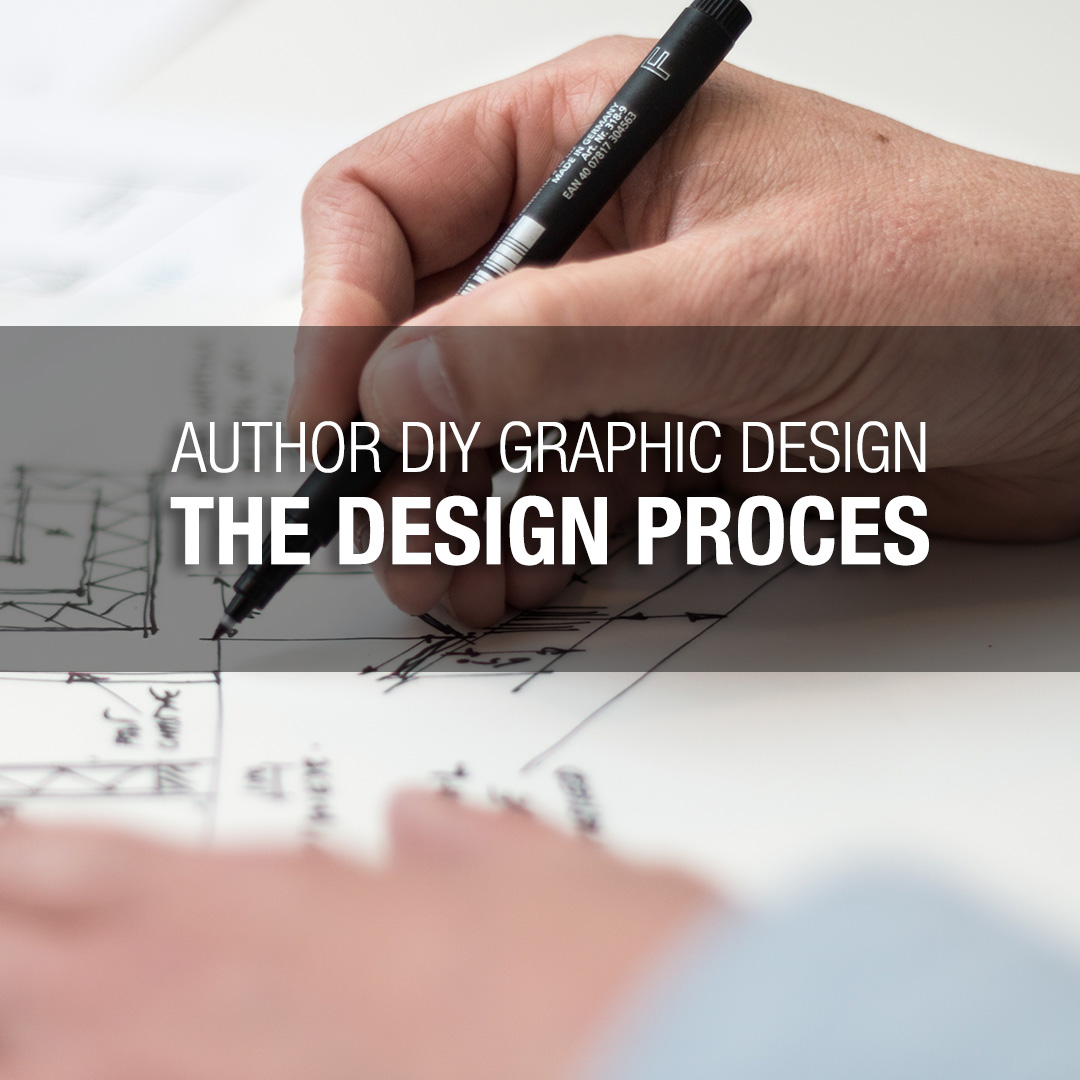
Author DIY Graphic Design – The Design Process
Estimated Reading Time:
Complete Author DIY Series
- The Basics of Design
- Colour Theory
- Typeface
- Layout
- Tools and Technicalities
- Design Process
- BONUS: Print Book Formatting
Bravo! We have made it to the final blog post in the Author DIY Graphic Design series. Now we can apply everything we know into the design process. If you haven’t been following, for the past six months, we have been looking at the design fundamentals and theories that can help you improve your designs for your author brand and novels. Below are all of the blog posts to date:
Now, in this last post, we will be combining all of our new knowledge and seeing how we can apply them into a compelling book cover.
What makes an effective book cover?
This answer is quite broad. First, you must consider the genre that your book fits in. Remember throughout the blog series we have discussed the scope of your design project. To reiterate, the scope of your design project makes your job as a designer very clear. Design is functional art. It needs to serve a purpose otherwise it is directionless and has no value. 
The Design Process
All right, we’ve talked about a lot of theory and the scope of the project. Now, what do you do with all of this information? We start the design process.

What is the scope?
We have drilled this one into your head over and over again. We do know that the scope for this post is a book cover.

Research
If we are designing a book cover, then we know the scope of the project. Now, to ask the question again, what is your book’s genre? Once you know this, you can research into the target market. Take a look at what other book covers are doing for that genre. Jump onto Amazon, for example, and start filtering through the search engine to find your genre. Some questions to keep in mind are:
- What type of colours are being used?
- Are the covers using photos or graphic elements?
- What typefaces are used and how are they being treated?
- Where are the author name and the book title?
- Is there any more information?
Make Notes
These are just some of the questions that you can ask yourself. Keep notes as you research into your genre and see what the top-selling books are doing. It also helps to take a look at some of the worst selling – or rated – books. It is just as helpful to know what doesn’t work as what works.
Your notes are going to be incredibly helpful as you go through the design process. It is very easy to get sidetracked from your scope, so keep those notes nearby.

Thumbnails
Once you have done your research take a piece of paper and begin drawing. Oh no! Writers having to draw, this is scary. Do not fear though, take a look at the example of thumb sketches below, they do not need to be anything fantastic. The purpose of thumb sketches is to get the visual side of your brain thinking in abstract senses. These thumb sketches are more so visual roadmaps of where you can go.
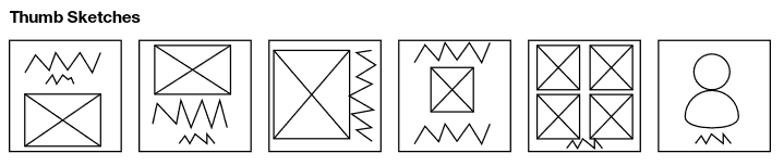
Try sketching out 10-15 of them. Thumbnails are small and do not need to take up a full page. Do not get hung up on the details of the thumb. Use boxes and squiggly lines to represent photos, text and other design elements. Once you have done around 15, pick your best three that can be brought into the next stage.

Roughs
Your roughs are where you can be picky about what the details look like. Here you can start exploring form to elaborate on where the vision in your mind is going. Look at the example below, this is no masterpiece or final product, but they tell you the primary direction that you want to go in.
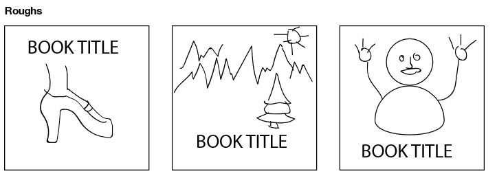
Take the three thumbnails that you decided to work with and flush them out more. Try doing three variations for each thumbnail concept. Once you have done this, think about which one is the strongest, this will be the book cover direction you will go with.

Finalize
Now that you have done your rough sketches, time to jump into the digital world. Where do you go from here? Well, it will vary depending on the graphics software you have. It will also depend on the book size. Is it a trade paperback? Is it ebook only? Take a look at some of the specs for your cover type.
As we had discussed before in the Tools and Technicalities blog post, you will want to be aware of your colour mode, DPI and dimensions for your book. Explore the Tools and Resources section that shows where you can find photos and graphical elements. Reference the Colour Theory post to know how to create pleasant colour schemes. Look back at the Typefaces post to understand how to treat your text. The Layout post will expand on some layout theory on how to create a hierarchy of importance for the elements on your cover (book title, author name, etc.).
Your Exercise
Apply the knowledge you have learned from the Author DIY Graphic Design series to your next design project! Step up your branding and marketing by creating engaging visual messaging that has an impact on your reader. Unfortunately, the cliché is true; people do judge books by its cover. If you have to make your cover, it is essential that you invest into creating an eye-catching design.

About Konn Lavery
Konn Lavery is a Canadian author whose work has been recognized by Edmonton’s top five bestseller charts and by reviewers such as Readers’ Favorite, and Literary Titan.