Complete Author DIY Series
- The Basics of Design
- Colour Theory
- Typeface
- Layout
- Tools and Technicalities
- Design Process
- BONUS: Print Book Formatting
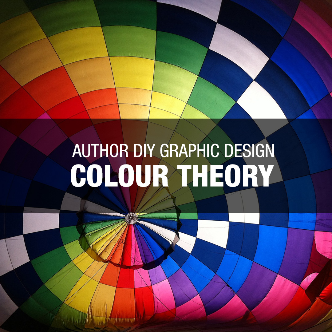
Following the Author DIY Graphic Design – The Basics post back in July, the series continues with part two: Colour Theory. Colour is an incredibly important part of graphic design, no matter how much or how little you use of it. The choice of values (the choice of colour) and tones (the amount of light or dark) will drastically change the impact of your novel. Do you think George Orwell’s 1984 novel cover would have the same effect if it were hot pink? Probably not. Why did the designer choose to go with those colours? We’re going to dive into colour schemes, the psychology of colour and some tips that can help you pick the best colours for your project.
Keep in mind; colour theory is a broad topic. Design degrees have entire courses dedicated to the study of colour. In the spirit of the DIY Graphic Design for Authors series, we will travel the surface of the theory and then discuss how you can apply it to your work.
Colour Schemes
Colour schemes are essentially the parameters that your colour choices will follow. They allow the colours to work with each other seamlessly. Your colour scheme can consist of two or more swatches. As an unwritten rule, you don’t want to have more than five values in your colour scheme. You will be bombarded with too many choices.
Monochromatic
The most basic of colour schemes. As shown in the example, this consists of one value and a range of tones. You can have your swatches be saturated into grayscale too; commonly seen in corporate logos. An example of a monochromatic scheme would be black, white and red. This combination creates a high impact visual due to the harsh contrast.
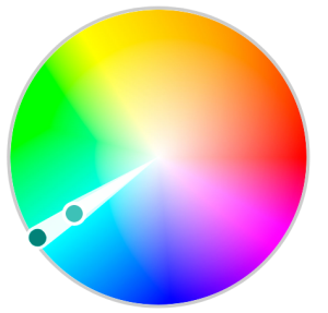
Complementary
The complementary colour scheme introduces a secondary value on the opposite end of the colour wheel as shown in the example. Like monochromatic, you can pick a range of tones.
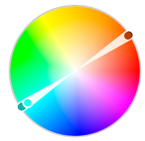
Triad
The triad colour scheme is like the complementary scheme except it adds a third value. Each value is equally distributed across the colour wheel. This colour scheme is more complicated to work with due to the amount of choice you have.
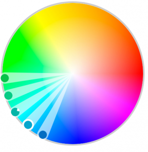
Analogous
A different type of colour scheme is analogous which consists of values directly across from each other on the colour wheel.
There are more colour schemes out there such as compound and split complimentary but these become increasingly complex, and I wouldn’t recommend exploring these unless you want to push your capabilities in colour.
Psychology of Colour
Colours express moods. How do you know which colour represents what? Great question, below is a basic breakdown of some of the more common colours:

Red and Oranges
Reds are aggressive, high-energy and are more proactive. Oranges are similar but softer. They can also be more energetic than reds depending on how vibrant they are.

Yellow
Yellow is like oranges but is far less aggressive. Our eyes naturally move towards bright colours, which is why you see yellows used in construction, caution tape and on specific animals.

Green
This colour is linked with nature, growth or money, depending on the tone of green. Yellow-based greens are more connected with nature where blue-based greens are cooler and are more mechanical.

Blue
Depending on the tone, blues can be warm or cold. This colour is the most neutral used and seen in large corporations. For example, Wal-Mart once had a darker blue until they went through a rebrand with a warmer blue to express friendliness. Wal-Mart also introduced a yellow sun as a highlight colour.

Know your Project
Something I will be mentioning over and over again in this DIY Graphic Design for Author series is to know your project. Knowing your project will help you understand what colours will work well. If you are working with a science fiction book, astral values will fit well. In a horror novel, you might see darker tones and perhaps red. Research the market that you are targeting on Amazon, Kobo or even in a bookstore to see what other designers are doing.
Tips and Resources
Below are some tips and resources that can further assist you in working with colour.
You can also use tools like Adobe Color CC (color.adobe.com) or Sessions College Colour Calculator (sessions.edu/color-calculator) or Canva (Color Wheel) which is a highly useful tool for picking out colour schemes.
Further resource on colour psychology can be found on jenreviews.com’s COlor, Meaning, Symbolism, And Psychology: What Do Different Colors Mean article.
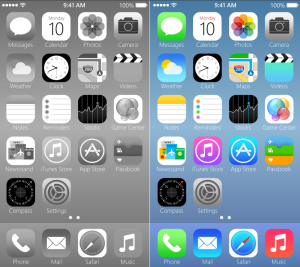
Work in Grayscale
Still unsure how to properly use colour? A great trick is to work only in tones (black and white) and then switch the various grey swatches to a value. Take a look at the iPhone mockup below. On the left, we have the phone in black and white and on the right we have the phone in colour. Notice how the vibrant colours stand out because they have a higher tone of white and black?
Reference Nature
If you are unsure of what colour to use, an effective method is to reference nature. Nature got colour right because it all serves a purpose on every animal, plant and landscape. For example, poisonous animals tend to be very vibrant and loud to get your attention. Animals that live in the wilderness – like in Canada have neutral tones to help them camouflage in their surroundings. Take a look at the examples below; you could sample colouring from either one of these images.


Your Exercise
Got a book cover to make? How about a poster or banner? Explore some colour schemes, perhaps three. If you are stuck or have additional thoughts, please share in the comments.


No Comments