Author DIY Graphic Design – Tools and Technicalities
Estimated Reading Time:
Complete Author DIY Series
- The Basics of Design
- Colour Theory
- Typeface
- Layout
- Tools and Technicalities
- Design Process
- BONUS: Print Book Formatting
These are all very theoretical based, and we have yet to discuss graphic design tools and technicalities. The theory is highly relevant because what you learn can be applied to an array of situations. The tools and technicalities are more constrictions on how you can integrate the theory. In the Layout issue, we go to explore some technicalities due to the nature of formatting a document. Now, we get to go further into the parts of a document and how to properly read the specs seen in print shops so you too can communicate with the printers.

Common File Formats
If you’ve worked on a computer, you must be familiar with file formats. Now, some computer settings hide the file format, but this can be disabled depending on your device. For example, most writers work in word documents which usually a .doc or a .docx.
For design work – and keeping in the scope of the series – such as a book cover, you will be looking at a range of file formats. Some of the common ones are below:
- JPG: Used as a standard for web and print. A JPG file is for photos or high-detailed renderings, such as book covers.
- PNG: This file format is on the web due to its support of transparency which works great for logos and icons. However, they are generally much more extensive in file size.
- TIFF: A print file format that stores a lot of the original quality of the image, whether it was scanned from a scanner or exported from graphics software, like Photoshop.
- PDF: A very versatile file format, often seen in print. A PDF can serve many functions and needs. Some print shops prefer if you only provide PDF formats of your designs.
- PSD: The standard for Photoshop documents. Other graphics software can open PSDs.
- SVG: A graphic format seen on the web that supports vector graphics, more info below.
What file format do you use?
Remember the common theme? Scope. Each of the file formats mentioned server a unique purpose. Recall what the scope is for your project and then you can make an educated decision. Read the specifications from the print shop, such as Kindle Direct Publishing, or on the printer company’s website. These will tell you what files they prefer.
Print Vs Digital
Some of the file types mentioned previously are in print and web. While others, such as TIFF, cannot. All files also have two primary specs that you should be aware of:
- Colour Format: There are two main colour formats – and several less important ones – that everyone uses with graphic design. CMYK (Cyan, Magenta, Yellow, and Key Black) and RGB (Red, Green, Blue). Without getting too technical, CMYK is for print and RGB is for the web. If you end up using the wrong colour format, your colours will be a mess. Colour formats are controlled in the graphic design software of choice.
- DPI: Dots Per Inch controls how detailed the design is. It dictates how many times the printer drops ink onto the page in a square inch and how many pixels to render on a screen in a square inch. There are many more technicalities to how this works. I’d recommend googling it to learn. In general, print often works at 300 DPI and digital works at 72 DPI.
Raster Vs Vector

wikipedia.org
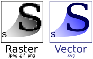
In addition to the file specs mentioned above, you have two types of renderings: Raster and Vector. Raster images are what we are most familiar with seeing. These images are made up of hundreds or thousands of tiny square coloured pixels that create the image. Vector images are based on math and are resolution independent. The diagram below elaborates more in the difference between raster and vector graphics when zooming in.
Print Specs
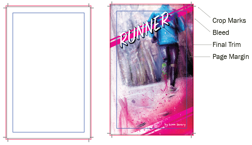
We’re going to jump over web specs. The colour format and DPI are the two most important things for the web. For print, there are more specs to be aware of. Below is a demonstration of a book cover. On the left side is an empty document with coloured boxes. The right has the same coloured boxes and the book cover design.
Depending on your graphic design software, each program will display these bounding boxes differently. Some print shops even offer templates – in PSD or PDF – formats that have these set up for you.

- Crop Marks: These small slits help the printer to know where to cut the paper.
- Bleed: When you are printing on paper, and what to take up the full document from corner to corner, the way to do this is with bleeds. Bleeds are an additional space beyond the document itself, and the design elements are also on the bleed. Crop Marks align with the bleeds so when the printer cuts, it doesn’t leave any white space behind. Try printing out a photo and then cut it out, it is challenging to exclude white slivers on the edges. Bleed sizes will range, be sure to check with the print shop on what bleed size to use. Often 0.125” or 0.25” on each side is standard
- Final Trim: This is the edge of the finished piece after the printer has trimmed off the bleeds and crop marks.
- Page Margin: The page margin is the safe space to include all of the critical information on the document. Margins will range depending on the project. The safe-zone for your content is there in case of a printer shifts the paper, or when trimming the crop marks, they cut too close. Stay within the recommended margins, and you won’t have any information cut.
Print Specs vary from Shop to Shop
The technicalities mentioned above will vary depending on the shop. There are some standards across the board since a lot of them use similar printers and processes. Especially in digital printing vs offset printing. Be sure to ask your print shop or review their specs online. Amazon’s Kindle Direct Publishing outlines all the specs needed.
Graphic Design Tools and Technicalities Resources

Okay, we’ve covered many technicalities, now, let’s go over some tools. We will not be discussing each software and how they work. There are full resource books, courses, and website dedicated to learning how they operate. What we will do is separate the resources into paid and free categories so you can determine how you want to control your budget.
Doing graphic design as a profession, I am biased and would recommend the paid software. The reason for this is you get more tools readily available, and you get to work with industry standard files. Freeware can also be buggy and limited.
Paid Tools and Resources
- Adobe Stock (graphics and stock photos)
- Photobucket (graphics and stock photos)
- Corel Draw (Software Suite)
- Adobe Creative Cloud (Software Suite)
- Photoshop
- Illustrator
- InDesign
Free Tools and Resources
- thenounproject.com (graphics)
- vecteezy.com (graphics)
- color.adobe.com (colour)
- pexels.com (stock photos)
- freeimages.com (stock photos)
- Pikwizard (stock photos)
- canva.com (software)
- edit.org (software)
- Gimp (software)
Your Exercise
We’ve covered graphic design tools and technicalities from a high-level perspective. Now, in preparation for the final blog post, obtain a graphic design software and become familiar with the interface and the tools within the program. Gimp is a free program that mirrors a lot of Photoshop’s capabilities. Alternatively, you can download a trial run of Photoshop for 30 days. For the final blog post, we will combine our new knowledge and design an awesome book cover.

About Konn Lavery
Konn Lavery is a Canadian author whose work has been recognized by Edmonton’s top five bestseller charts and by reviewers such as Readers’ Favorite, and Literary Titan.


