Author DIY Graphic Design – Layout
Estimated Reading Time:
Complete Author DIY Series
- The Basics of Design
- Colour Theory
- Typeface
- Layout
- Tools and Technicalities
- Design Process
- BONUS: Print Book Formatting
The layout is a critical part of all design projects. It is the final gatekeeper of how the public eye will perceive your work. In a way, the layout is the collage of all your previous efforts put on the page. We’ve previously discussed your design basics (shape, form, etc.), colour theory, and typeface. The previous topics all come together into the layout.
How to Start Your Layout
![]()
Making a layout will range drastically from a single column layout or multiple columns or even varying columns throughout the page. There are many options, as with all aspects of design and you can quickly become overwhelmed with the number of choices that you have in front of you. Remember, the critical thing in design is that design is functional art. We’ve discussed the importance of the scope of your project numerous times. The scope applies to your layout as well. This will help you break down what type of layouts you should use.
What type of project is it?
As authors, making our own designs, we might find ourselves designing a book cover, the interior formatting of our pages, a poster or even business cards. Each one of these will have a different layout.
- Book Covers: Book covers tend to follow standard rules of large typography that will be easily readable if the book cover is shrunk to a small size (like on Amazon) or seen from a distance. Depending on your genre, you also have some freedom to explore creative ways of breaking up the text into rows or columns. Research your genre, examine what other book covers are doing, and see if that applies to your work.
- Book Interiors: You don’t want to stray too far away from the standard one column layout with the interior of your book. Readers are familiar with this format, indentation and standard typography sizes (10pt or higher). You can explore some exciting typefaces and layout options for your chapter headlines, but it is strongly recommended not to push too far out of the ordinary and alienate readers. You could potentially lose sales.
- Posters, Postcards, and Banners: Very similar to book covers, you want your posters and postcards to be eye-catching, easy to read and easy to understand. Your poster design might be for a book launch or book signing, or maybe it is a digital book release. Regardless, you will eventually need some form of advertising. Your layout will depend on the amount of information you need to display. If it is a banner, you will want the primary information to be seen upfront and centred while the secondary (contact information for example) can be much smaller when people are close to the banner.
- Business Cards: Business cards offer a lot of Depending on the print shop you are working with, you have an array of paper types and finishing options. Regarding layout, usually, you have two categories: portrait and landscape layout. The amount of information you put on your card will affect the design as well. The less content on a business card, the more creative elements you can have on the card.
There are many other types of projects that you could find yourself doing as well. These are some of the more common projects, as an author, that you might have.
What is a good layout?
Now that we’ve discussed what type of project you have, and the common layouts used in these project types, we can use some design theory to make the right fitting layouts.
Grid Layouts
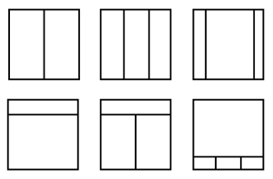
Grid layouts are a common way for designers to format their various elements (graphics, text and photos) onto the page. The lines and boxes shown in the example are merely for demonstration purposes. The boxes in a grid layout are to help guide you to know where to place your content and are removed upon your final design.
Grid layouts work exceptionally well when you are working with large sums of text, like a magazine, a website, or a book. The example in the top right with the two small columns and one full column is commonly seen in magazines, newspapers and social media sites. The reason? It is incredibly useful. The large column is your primary content and advertising goes in the smaller columns.
Golden Ratio Spiral
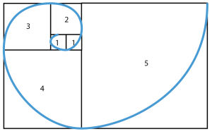
The golden ratio spiral is different from the grid layouts. It focuses on the hierarchy of information and drawing the viewer’s focus. As seen in the example, number one is the smallest square. Each square multiplies in size with five being the largest and the most visible. These squares would not be in your final design, but your elements would fit into these boxes.
Freedom to Experiment
You also have the freedom to play. The golden ratio spiral doesn’t have to be a wide rectangle as demonstrated. It could be rotated any way you wish. Once you start to train your eye, you can begin to bend and, dare I say it? Break the rules. Try a golden ratio spiral inside of a grid layout or vice versa.
Squint Eye Technique
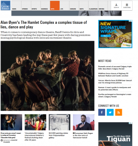
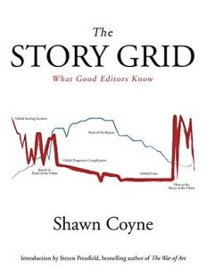
Still confused on what to do for your layout? Look at the two examples below, one is a screenshot from the Calgary Herald website and the second is The Story Grid book. Squint your eyes and see what elements are still the most visible. This technique is pretty old school and very useful. Squinting your eye shows you first hand what are the most apparent items on the page.
When you squint your eyes, are the essential pieces (like your book title on the cover) in your layout visible? Or is another element easier to see?
Your Exercise
Pick up a pen and paper and draw! I know, drawing is scary, we are more comfortable with words. Remember, you’re not making the next Mona Lisa, you’re making concepts to guide you on where to go next with your design.
Try drawing boxes on a small-scale size (like in the examples above) for your project or make up a project like a book cover. The smaller boxes inside will represent text and photos. Experiment with grid layouts and the golden ratio spiral. See what type of creative book cover layouts you can come up with!

About Konn Lavery
Konn Lavery is a Canadian author whose work has been recognized by Edmonton’s top five bestseller charts and by reviewers such as Readers’ Favorite, and Literary Titan.


