Mental Damnation: Reality Design Direction
Estimated Reading Time:
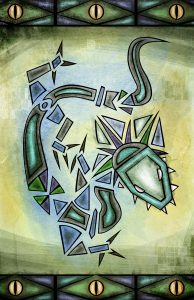
In relation to the announcement of the second edition of Mental Damnation: Reality, the novel has a new visual direction as well. Initially the Mental Damnation series had a lot of design elements inspired from artwork seen in ancient Egypt and South America. It had a lot of vibrant colouring, grungy textures and crude line work. This direction was seen in the cover artwork, illustrations, book trailers and marketing material.
The series has always had a lot of visual support to help set the mood and has been an important part of the whole experience, much like audio was for Seed Me. This post will shed some light on what the new design direction will encompass.
Influences From the Right Time Era
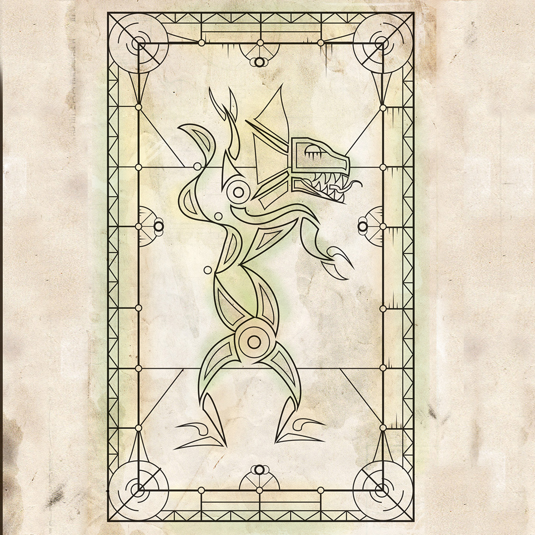
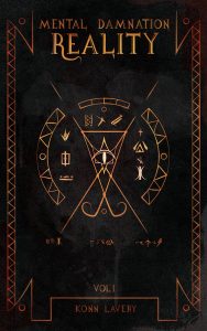
After reworking the book’s lore and revamping the names of of various cities, creatures and characters, I wanted the design and artwork to reflect this. The new cover is a good indicator of how the artwork has been shifted to detailed line work pressed into leather – a very common way to bind book in the medieval times.
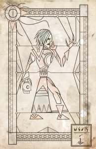
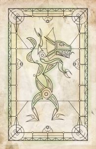
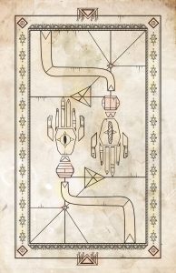
Naturally, the interior should reflect the novel as a part of this era. A lot of the illustrations found in books such as the Codex Gigas (a major inspiration for the new visual direction) have heavy focus on the clean, complex, line work and less about the colouring.
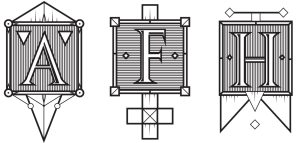
Mental Damnation Reality Drop cap Characters
A new addition that will be seen in the physical books are drop cap characters at the beginning of the chapters. During the medieval times, monks and priests were often the only people capable of writing books. Each one had their own signature drop cap at the beginning to identify that they wrote the book. So why not implement Mental Damnation drop caps?
The City of Renascence – Home of the Vazeleads
The original map of the vazelead’s home city was rather inaccurate in terms of size ratio and placement of buildings. The new map – with the new city name The City of Renascence – shows an accurate size of how large the city actually is. New areas of importance have been marked such as Scum Tower.
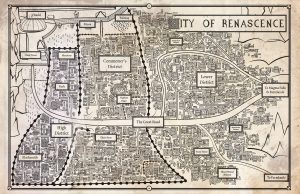
Updated Illustrations
In complements to the map and cover, the illustrations have been reworked by removing the colouring and focusing on detailed linework.
Be sure to follow the Facebook page, Twitter or my Instagram as more illustrations are revealed!

About Konn Lavery
Konn Lavery is a Canadian author whose work has been recognized by Edmonton’s top five bestseller charts and by reviewers such as Readers’ Favorite, and Literary Titan.


