The Pentawreath – Concept to Final Piece
Estimated Reading Time:
November 29th a new design I completed was released for SANE Clothing’s Christmas line. The piece itself was a digital illustration with a number of conceptual revisions coming from the the original piece back in 2014.
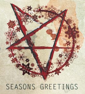
Originally the concept was a part of the Mental Damnation newsletter as a fun-themed approach to the holidays. Since the novel series deals with hell, why not throw some haunting imagery into a Christmas newsletter? After the holidays of 2014, the design didn’t go anywhere until a discussion came up during the summer of 2015 with SANE Clothing for a holiday clothing line. This triggered the memory of the pentawreath and I got to work.
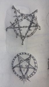
I revisited the original design that was a 15 minute effort in Adobe Illustrator and realized that the design could be drastically improved by steering the concept into a new direction. The next step was drawing thumb sketches of pentagrams and wreaths to familiarize myself with the two types of designs and what intriguing ways the two could be merged together.
The trick was not to make it too seasonal and not too horrific, otherwise one side would overpower the other. Ultimately it took a cartoon approach, allowing me to harmonize the pentagram and the wreath. I went this route since the original concept was meant to be humorous. It stayed fairly true to the original concept with the un-even archaic look of the star.
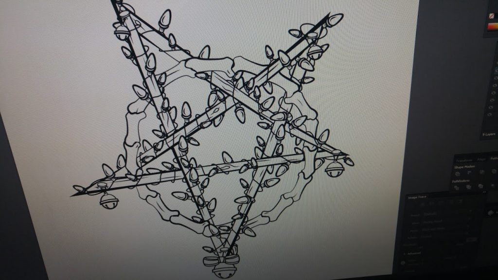
I took one of the thumb sketches from my sketchbook and traced it in Adobe Illustrator to get the thick line work. Afterwards it was brought into Adobe Photoshop where I painted the design to render the texture and shading as seen below:
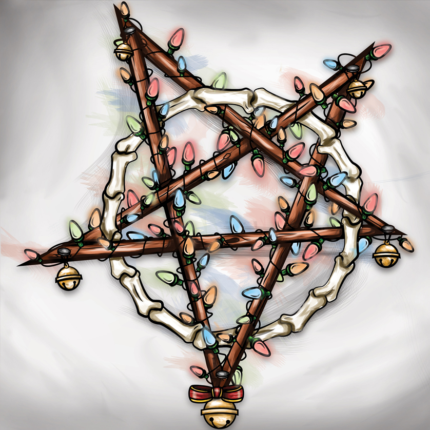
The design has no relation to the Mental Damnation series but was initially inspired by it. This piece allowed me to start thinking outside of the box from my usual graphic design work. It made me work with a cartoon style opposed to my other work which has been either corporate oriented or the ancient civilization themed artwork found in the Mental Damnation series.

About Konn Lavery
Konn Lavery is a Canadian author whose work has been recognized by Edmonton’s top five bestseller charts and by reviewers such as Readers’ Favorite, and Literary Titan.


